SwiftToast


A customizable iOS toast view for Swift
Example
To run the example project, clone the repo and open SwiftToast.xcworkspace from the Example directory.
Requirements
- Swift 3
- iOS 9.0 or higher
Installation
CocoaPods
SwiftToast is available through CocoaPods. To install it, simply add the following line to your Podfile:
pod "SwiftToast"
Carthage
Simply add the following lines to your Cartfile:
github 'damboscolo/SwiftToast'
Usage
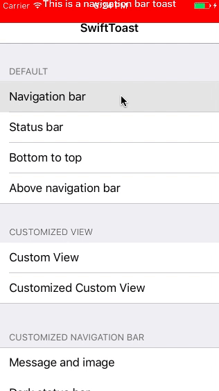
Toast Style
You may choose between three styles
enum SwiftToastStyle {
    case navigationBar
    case statusBar
    case bottomToTop
    case belowNavigationBar
}
To present
A simple animated presentation:
let test = SwiftToast(text: "This is a Toast")
present(toast, animated: true)
Dismiss
Automatically
The SwiftToast dismiss is controlled by the attribute duration. When it’s over, the toast automatically dismiss.
Another attribute that control is isUserInteractionEnabled that is true by default. When user touch above the toast it will automatically dismiss.
Programatically
If you want to manually dismiss the toast, you can set isUserInteractionEnabled to false and duration as nil:
let test =  SwiftToast(text: "This is a SwiftToast",
                       duration: nil,
                       isUserInteractionEnabled: false)
present(toast, animated: true)
And to dismiss:
dismissSwiftToast(true)
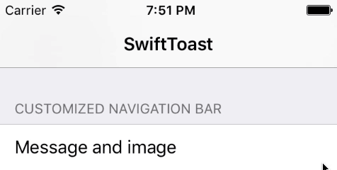
Customization
SwiftToast is very customizable. You may customize when you create SwiftTost object. Like this code:
let test =  SwiftToast(
                    text: "This is a customized SwiftToast with image",
                    textAlignment: .left,
                    image: UIImage(named: "ic_alert"),
                    backgroundColor: .purple,
                    textColor: .white,
                    font: .boldSystemFont(ofSize: 15.0),
                    duration: 2.0,
                    minimumHeight: CGFloat(100.0),
                    statusBarStyle: .lightContent,
                    aboveStatusBar: true,
                    target: nil,
                    style: .navigationBar)
present(toast, animated: true)
That generates this
Or you can change the default values, even the text, so all future presented toasts will look the same:
SwiftToast.defaultValue.text = "This is a Toast"
SwiftToast.defaultValue.backgroundColor = .green
SwiftToast.defaultValue.image = UIImage(named: "ic_alert")
SwiftToast.defaultValue.style = .bottomToTop

let toast = SwiftToast(text: "This is another Toast")
present(toast, animated: true)
Custom SwiftToastView
To use a custom .xib, you have to implement your as class as SwiftToastViewProtocol
protocol SwiftToastViewProtocol: class {
    func nib() -> SwiftToastViewProtocol?
    func configure(with toast: SwiftToastProtocol)
}
Basics class for a custom SwiftToastView
struct CustomSwiftToast: SwiftToastProtocol {
    // Protocoled
    var duration: Double?
    var minimumHeight: CGFloat?
    var aboveStatusBar: Bool
    var statusBarStyle: UIStatusBarStyle
    var isUserInteractionEnabled: Bool
    var target: SwiftToastDelegate?
    var style: SwiftToastStyle

    // Customized
    var title: String
    var subtitle: String
    var backgroundColor: UIColor
}

class CustomSwiftToastView: UIView, SwiftToastViewProtocol {

    // Customized
    @IBOutlet weak var titleLabel: UILabel!
    @IBOutlet weak var subtitleLabel: UILabel!
    @IBOutlet weak var viewMinimumHeightConstraint: NSLayoutConstraint!

    // Protocoled
    func nib() -> SwiftToastViewProtocol? {
        return Bundle.main.loadNibNamed("CustomSwiftToastView", owner: self, options: nil)?.first as? CustomSwiftToastView
    }

    func configure(with toast: SwiftToastProtocol) {
        if let customToast = toast as? CustomSwiftToast {

            // Put your configure code here. e.g.:

            // subtitleLabel.text = customToast.subtitle
            // backgroundColor = customToast.backgroundColor

            // Setup minimum height if needed

            // if let minimumHeight = toast.minimumHeight {
            //    viewMinimumHeightConstraint.constant = minimumHeight
            // }
        }
    }
}
Present a custom SwiftToastView
To easily present a custom toast view:
let customToast = CustomSwiftToast(
                    duration: 3.0,
                    minimumHeight: nil,
                    aboveStatusBar: true,
                    statusBarStyle: .lightContent,
                    isUserInteractionEnabled: true,
                    target: nil,
                    style: .navigationBar,
                    title: "CUSTOM VIEW",
                    subtitle: "This is a totally customized subtitle",
                    backgroundColor: .blue
                    )
present(customToast, withCustomSwiftToastView: CustomSwiftToastView(), animated: true)
Delegates
SwiftToastDelegate has 3 optional delegates. They are set on the property target and are called when:
- Return the presented
SwiftToastheight:func swiftToast(_ swiftToast: SwiftToastProtocol, presentedWith height: CGFloat) - Dismissed
SwiftToast:func swiftToastDismissed(_ swiftToast: SwiftToastProtocol) - If
isUserInteractionEnabledaretrueand the user touched up inside the toast:func swiftToastDidTouchUpInside(_ swiftToast: SwiftToastProtocol)
Configuration
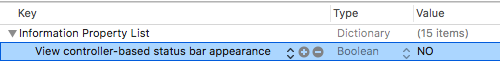
To statusBarStyle works, you have to add row View controller-based status bar appearance on your Info.plist project and set to NO.
Default values
| Property | Type | Default value | Definition |
|---|---|---|---|
text |
String |
”” | Toast text |
textAlignment |
NSTextAlignment |
.center | Text alignment |
backgroundColor |
UIColor |
.red | Background color |
textColor |
UIColor |
.white | Text color |
image |
UIImage |
nil | Toast icon |
font |
UIFont |
.boldSystemFont(ofSize: 14.0) | Text font |
duration |
Double |
2.0 | Duration to dismiss. If nil, don’t dismiss automatically |
minimumHeight |
CGFloat |
nil | Minimum toast’s height. If nil, uses dynamic minimum height |
statusBarStyle |
UIStatusBarStyle |
.lightContent | Status bar style during toast appearance |
aboveStatusBar |
Bool |
false | Show/Hide status bar during toast appearance |
isUserInteractionEnabled |
Bool |
false | If true, dismiss on click. If false, don’t dismiss on click |
target |
SwiftToastDelegate |
nil | Click on toast delegate |
style |
SwiftToastStyle |
.navigationBar | navigationBar, statusBar or bottomToTop style |
Author
damboscolo, danielehidalgo@gmail.com
License
SwiftToast is available under the MIT license. See the LICENSE file for more info.